
My Roles:
- Information Architecture Design
- User Journeys
- Wireframing
- UI Design
- Prototyping
- User Research
The Solution:
A modern looking app, that was created by taking “on-the-go” context of a mobile user and organized information accordingly.
The Problem:
An app that totally overlooked the mobile context and interactions. Instead it tried to mirror the desktop website in its functionalities.

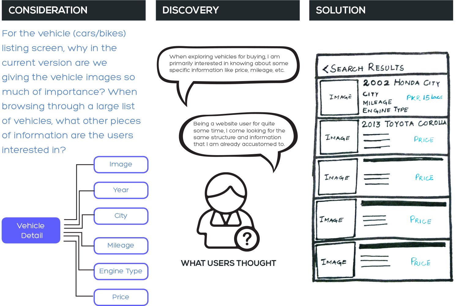
1. Constraints and Context
Before starting off to design an elegant and perfect solution for our app, it was first necessary to understand the use cases and scenarios in which our app would be used. In order vto make the picture clearer to myself, and to stay objective throughout the UX design process I answered the following questions and kept coming back to them for taking design decisions:
3. When & Where
The app would be used when a person wanted to buy a vehicle with certain attributes (such as a specific price range, make, model, etc.), or wanted to sell their own. The app would mostly be used away from the desktops and on-the-go, using an EDGE internet connection on which the maximum speed could only be 150 kbps.
4. Why
The users would be motivated to use our app because PakWheels has the largest online database of used vehicles in Pakistan. The whole platform gives a user the power to survey market prices and enables him to study market trends before selling or buying a vehicle.
1. Who
Our general audience was males in the age range of 25 years and above. These people were generally not very tech-savvy, mobile as a medium was comparatively new for them and they would fall into the category of low-literacy users as they didn’t really understand English very thoroughly.
2. What
The main actions that the users could take within our app were to search for suitable vehicles, filter down the results according to their needs, browse around the individual items, short list their favorite ones , interact with the owner of the vehicles and post their own vehicle ad.
2. UX Design and STrategy
I started working screen by screen, and carefully studied what were the pain points and where did the flow of the user journeys seem to be broken. To improve upon the whole experience, I stopped and thought what would be a user’s expectation at this point, what particular information would he need, and anticipated what his next steps could be. A glimpse of my thought process is given below:


3. Visual Design
After having intense discussions with the stakeholders (CEO & product manager), and going over several iterations at the wireframe stage, I finally moved into Photoshop where I could develop a visual language for the app. During this process, I kept in mind that majority of my audience would be using the app on an EDGE connection (150kbps max. speed) so I had to use minimum of external assets and rely heavily on typography spacings and color scheming only to create a unique look for the app. I primarily customized basic elements of Android UI Kit.

4. Prototype
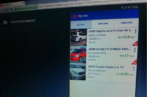
After the visual design was completed, I ported the mockups to InVision, the prototyping and workflow platform to get some feedback from real users. Observing the users interact with the app in real-time gave me an insight in advance into features and actions with which the users were still struggling and fumbling. For testing purposes, I gave these users some simple tasks that were most crucial and would be used majority of the tim for example, finding a particular type of car in a specific budget range, mileage, transmission type etc., and posting your own ad. After making my observations, I quickly revised some of the screens. For instance, while one user was searching for a car in a particular city, he missed out the text field where he could type out the city name. I fixed it up by adding an icon along with it so the field became more prominent and conspicuous.
5. Takeaway
I and our product team have been happy so far with how the Mobile App(s) have played a part in driving more and more traffic to PakWheels over last one year. The two graphs below clearly demonstrate that the sessions, screen views and used car leads are on gradual increase ever since the new apps were launched. Thus, with some thoughtful considerations we have successfully managed to re-launch a handy tool that makes buying and selling of vehicles utterly convenient.

6. User Research
In order to improve our apps and website, we conduct user testing sessions on a regular basis so that we can discover and iterate upon the weak areas.

Asking the right questions:
Asking the right questions is equally important to discover the weaknesses in an interface. We prepared a survey before hand so we could collect users’ data for our qualitative analysis. Sometimes we asked these questions directly, such as their literacy level and familiarity with English language, at other times we made silent observations, such as how easily the users could use filters to refine their searches and recorded their behaviour in our surveys.
Using this data, we then started making incremental changes in our UI, made improvements, and morphed the design into where it is now.
Targeting the right audience:
To discover the problems within our existing products, it is necessary that we target the right audience which lies in our persona group — males, with an interest in automobiles. The best opportunity to find them is at PakWheels’ AutoShows that are held in various cities around the year.
We put a user testing booth in the Lahore AutoShow 2015, and offered gift hampers to our participants. We uncovered and identified problems through questions and observations that were causing a hindrance for our users in finding the car/bike of their choice through our portals.